Mobile-Friendly & Responsive
What does mobile-friendly mean? It means a webpage is attractive and easy to use on a smartphone. "A website that is easy to use on a mobile device, especially the small screens of smartphones." - PC Magazine
What does responsive mean? It means a webpage rearranges itself to work and appear correctly on different screen widths. "Responsive web design makes your web page look good on all devices." - w3schools
Are all mobile-friendly webpages responsive? No. A webpage can display and work beautifully on a smartphone, but look awful on a desktop computer, because the webpage is still displayed the same way as on the tiny smartphone screen. Mobile-friendly does not guarantee responsive.
Are all responsive webpages mobile-friendly? No. A webpage can rearrange itself, adapt to different screen widths, but still look or work poorly on a smartphone, because certain elements appear or function poorly on smartphones. Responsive does not guarantee mobile-friendly.
How important are mobile-friendly and responsive web sites? Very important. 1) A large proportion of web traffic is now on smartphones (some statistics). However, desktop computers will also be widely used for the foreseeable future. So you need to cover both. 2) Would you want to use a web application that looked awful on your device (smartphone, tablet, laptop, or desktop) or was difficult to use? Obviously not. 3) Google recommends responsive design as a best practice. Bottom line: A web site should be both mobile-friendly AND responsive.
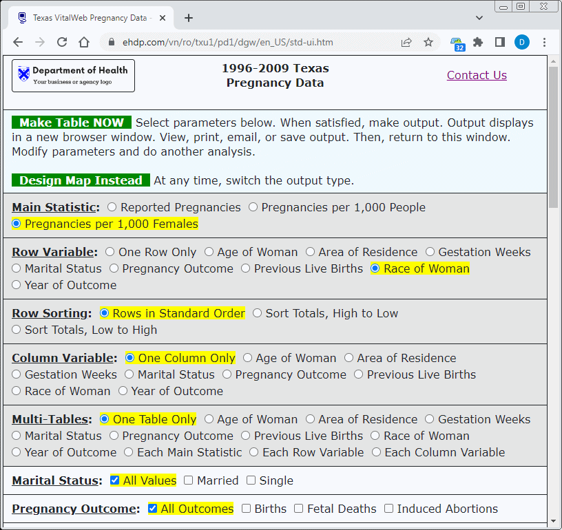
How does Vitalnet stack up? All Vitalnet output and web interfaces are both mobile-friendly and responsive. Vitalnet interfaces automatically rearrange their elements to appear and work correctly, at any screen width, as illustrated below. In addition, wide images (eg, maps) automatically adjust to fit small screens, and wide output tables may be horizontally scrolled. Google and other mobile-readiness tests verify that Vitalnet web pages, output, and interfaces are mobile-friendly. We also test by hand to verify that everything looks and works correctly.

Figure 1:
Responsive Web Design

Figure 2a:
Desktop - VitalWeb Standard

Figure 2b:
Desktop - VitalWeb Wizard

Figure 2c:
Desktop - VitalWeb Ajax

Figure 3a:
Mobile - Standard

Figure 3b:
Mobile - Wizard

Figure 3c:
Mobile - Ajax